
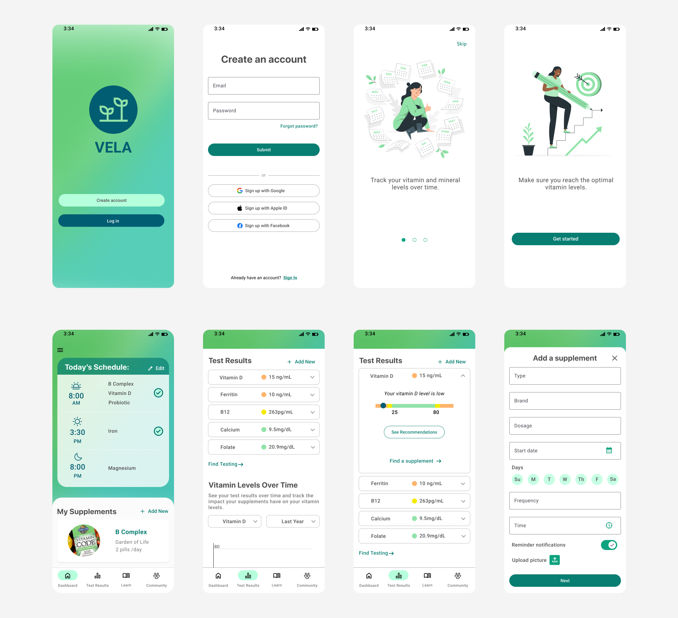
Vela
An app to help you track your vitamin levels over time, log your supplements and schedule reminders, and achieve your optimal vitamin levels.
The Project
Context:
Vitamin deficiencies are common and many adults use supplements to maintain their health — 42%¹ of the US population is estimated to be deficient in Vitamin D. 58%² of American adults are estimated to be taking supplements regularly.
Since most people are tested infrequently it can be hard to keep track of vitamin levels long term or note the impact of changes in supplementation. It can also be difficult to remember to take vitamins regularly, especially when they have to be taken at different times of day, and specifically with or without food.
The Challenge:
The challenge of this project was to create an app that would help users reach and maintain their optimal vitamin levels by providing a dashboard to track all the information related to their vitamin levels in one place, and provide push notification reminders to help users take their vitamins consistently.
1. “Prevalence and correlates of vitamin D deficiency” (NIH, 2011)
2. “Dietary Supplement Use Among Adults” (CDC, 2018)
Role
UX and UI Design
Scope
Mobile App Design:
User research, personas, sitemap, user flow, wireframes, usability testing, UI design
Tools
Figma
Miro
Optimal Sort
The Process

Understand & Empathize
User Interviews
Competitive Research

Define & Ideate
User Persona
Sitemap
User Flows

Design & Test
Wireframes
Usability Testing
UI Design
User Research
User Interviews
In order to gain a better understanding of the user needs this app could fulfill, I interviewed six people who have experienced a vitamin deficiency with the following research goals:
To better understand user behavior around how users currently keep track of their general health, as well as vitamin levels and supplements.
To determine how to best support them in correcting their vitamin deficiencies and maintaining their levels long term.
Collect data on what websites or apps they currently use related to their health, to see what they find useful.
Key Findings & Insights
Most of the participants went through periods where they neglected to take their supplements due to forgetfulness or falling out of the habit.
Building a habit or having a visual cue is key to continuing to take supplements - one participant needs to keep vitamin bottles visible on the counter to remember to take them.
Notifications can be effective in getting them to take an action - one participant follows the Apple watch notifications that they needed to stand up for a minute each hour.
Having data about their health readily accessible is motivating - several participants used an Apple watch to motivate them to move more.
Most got their vitamin level data from their doctor about once a year. One participant used 3rd party lab testing for specific vitamins.
All participants spent time searching online and researching supplements before choosing ones to buy.
Competitor Analysis
I analyzed four health-related apps that allow users to track their health data over time or get pill reminders.
HealthView provides an improved display for viewing data from the Apple Health app.
Healthily provides health tracking, symptom journaling, and health improvement programs.
Care of is an app for tracking vitamins, but they must be purchased from their company.
Round Health is a general pill/medication reminder app.
Key Findings & Insights
Data visualization must be easy to understand and allow users to drill into the details.
There is a risk in providing too many features, without providing comprehensive functionality for any of them.
The only direct competitor - Care of - has a very lengthy onboarding process that then requires you to buy their vitamin packs to use the app, making it inaccessible to anyone who doesn’t buy from them.
The feature of providing reminders is very useful - Round Health had very rudimentary functionality but allows users to enter any medication or supplement to set a reminder. It has very positive reviews with users mentioning how important the reminders are for them and how they like the simple interface.
Defining the audience
Problem Statement
Based on my research, I created a problem statement as a starting point for defining the purpose of the app.
Health-conscious individuals need a way to track their vitamin and mineral levels over time, so that they can address deficiencies and understand the impact supplements are having on their test results.
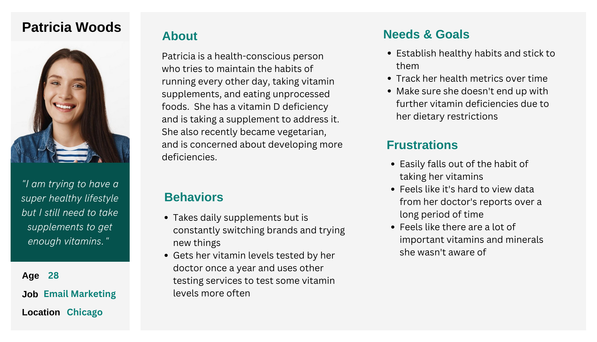
User Personas
I created a user persona to note the specific behaviors, needs and frustrations I discovered through my user interviews.
Ideation & Design
Defining the Core Features
With a better understanding of my user and their needs I identified four core features of the app.
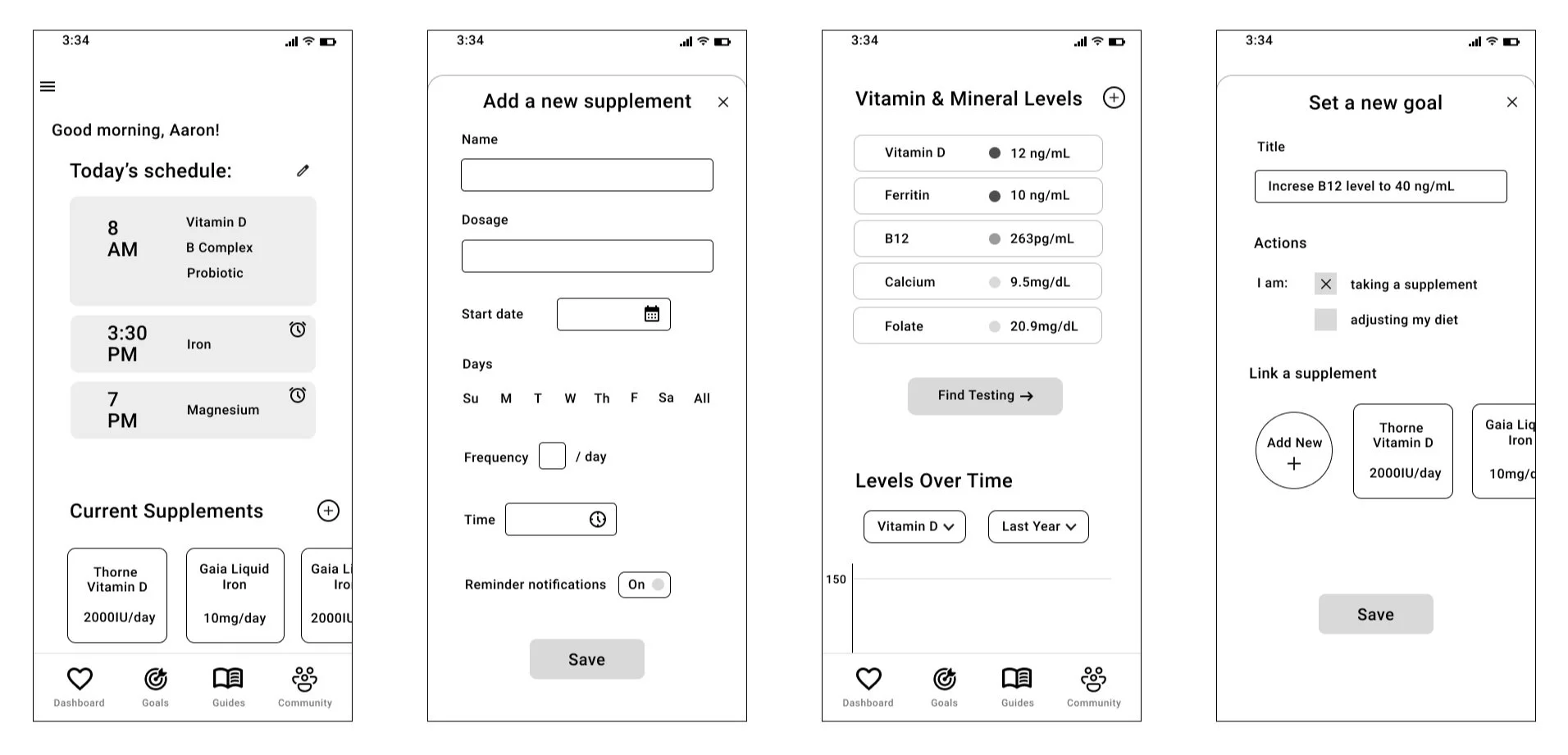
Add a supplement and schedule a reminder
Add a test result and provide a visual that illustrates whether it is in optimal range
View test results over time
Set specific goals for bringing your vitamin levels into optimal range
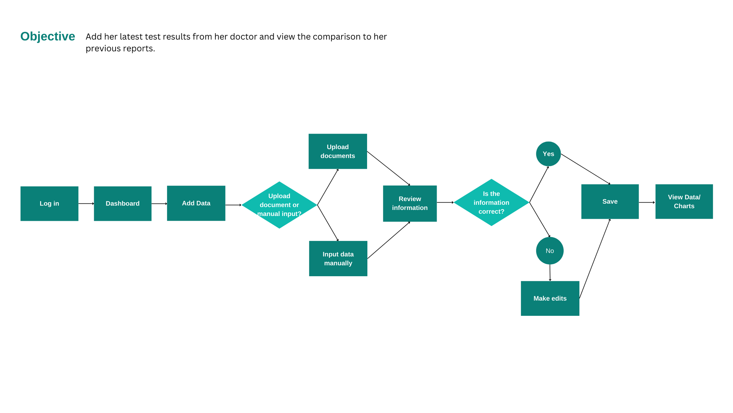
User Flows
I created user flows for the primary objectives of my persona - including adding test results, entering supplement information and scheduling a reminder. This gave me a clear view of the steps a user needs to take to achieve their goals.
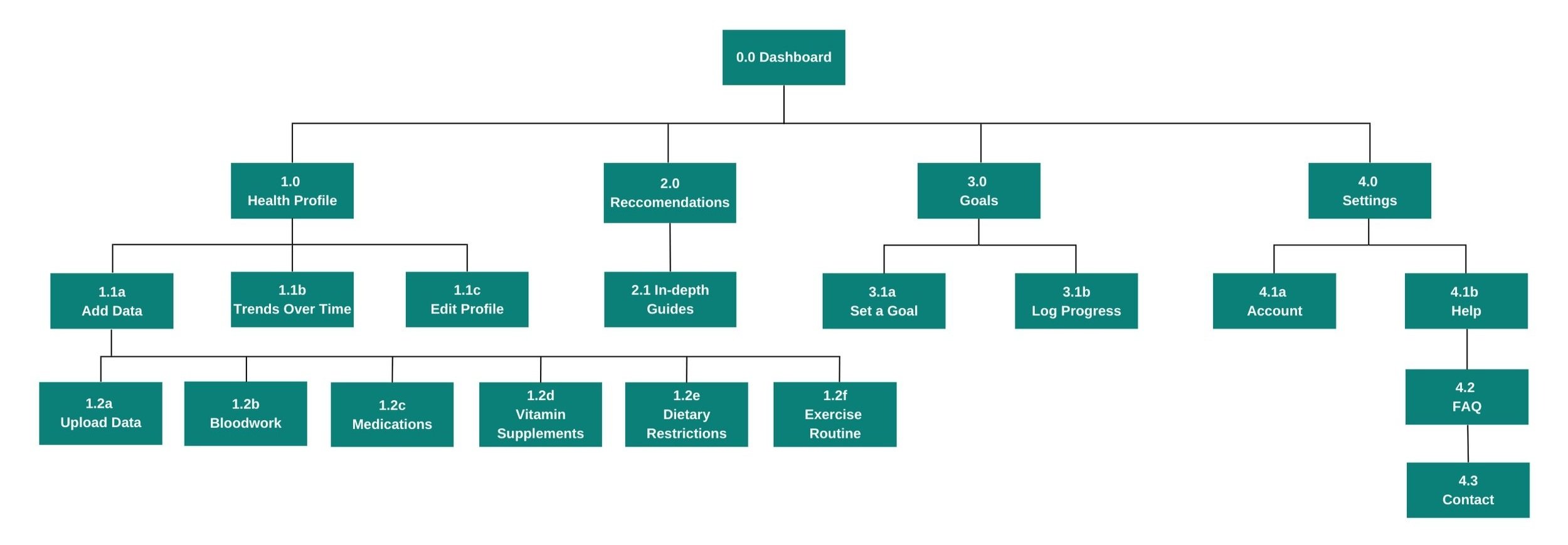
Sitemap
With my persona and primary user flows established, I created a sitemap to ensure that I had an understanding of the app’s basic structure. I then conducted a card sort to get some insight into how users would expect certain information to be grouped, and revised my sitemap based on those findings.
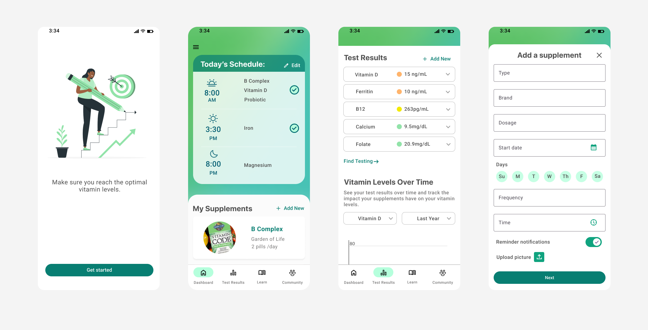
Wireframes & Prototype
After sketching ideas on paper I created mid-fidelity wireframes and further refined the details from my paper sketches. I created a prototype with these screens to prepare for usability testing.
Gathering Feedback & Iterating
Usability Testing
I created a usability test plan and script to prepare for conducting tests with six participants. The high level goals of the test were to observe how users navigate to complete specific tasks and to see how quickly users understood the purpose and value of the app. I narrowed down my testing group by doing a preliminary survey to make sure that all testers had taken a supplement or been concerned with vitamin levels at some point.
Key Findings & Insights
Users thought the dashboard could be simpler - too much functionality on the dashboard screen made it overwhelming. To address this I moved the Test Results and the Levels Over Time chart to a separate Test Results tab.
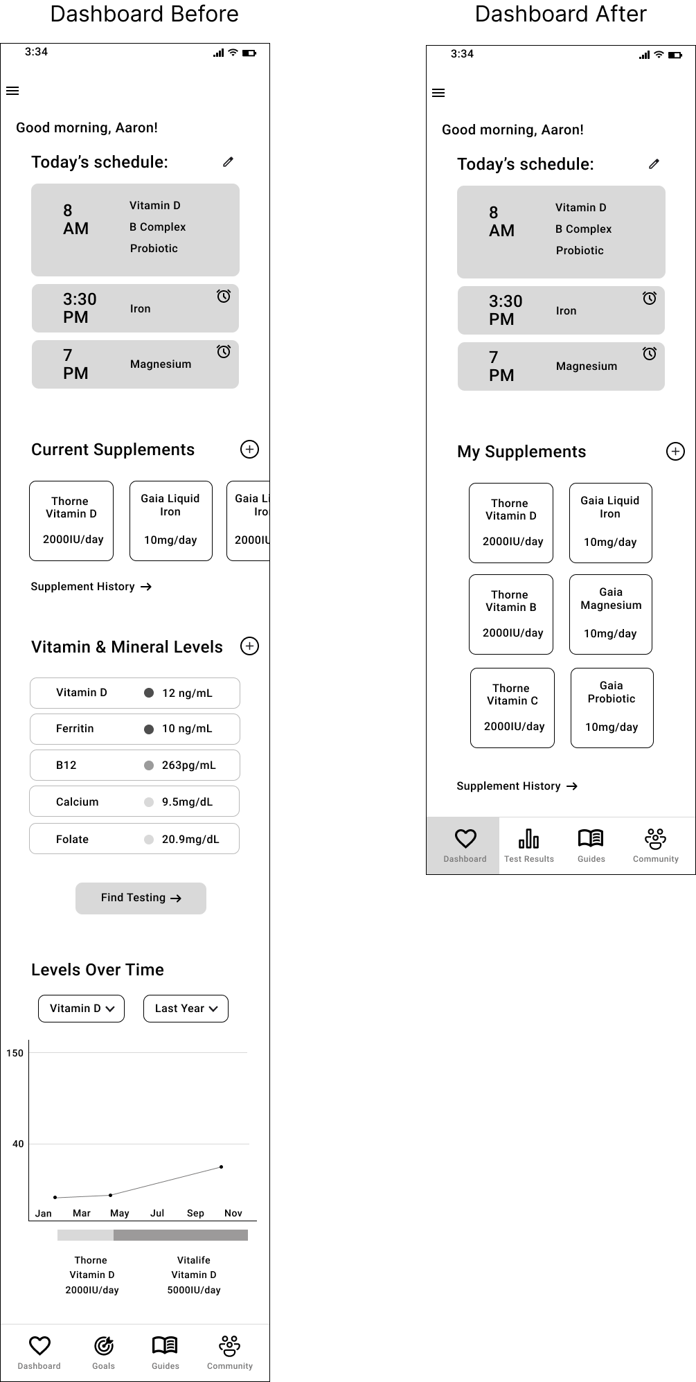
The Goals tab/feature seemed redundant and confusing because the goal of all users is to achieve their optimal vitamin levels. I removed this tab and the new Test Results tab replaced it. I also had the option here to select vitamin-rich foods as a means to increase vitamin levels rather than take a supplement. This feature was also removed, but relevant foods are still noted in the recommendations section of the Test Results tab.

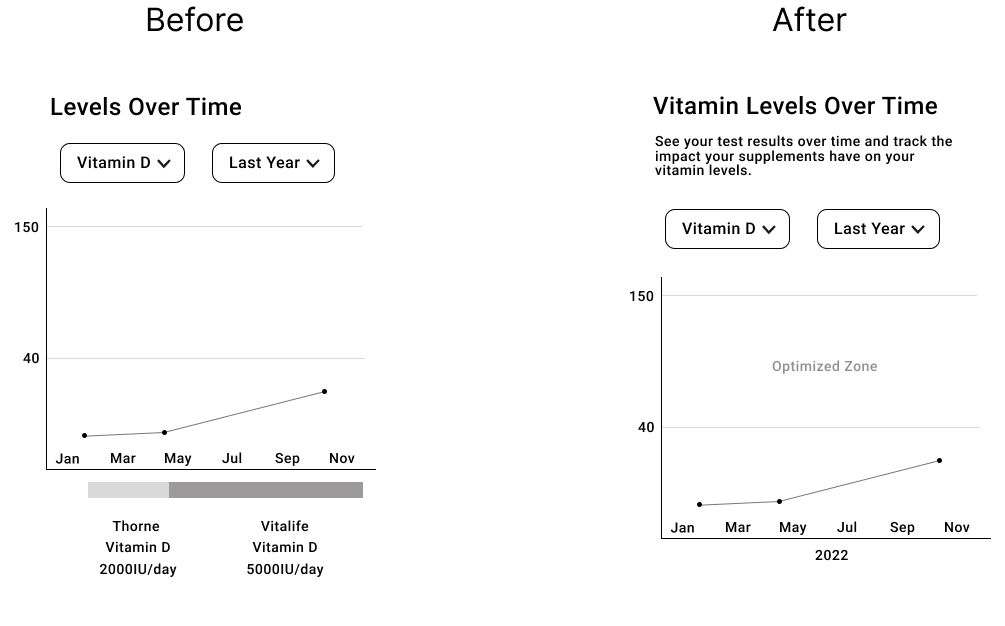
The Levels Over Time chart with the supplement timeline at the bottom was hard to understand. I added clarifying text, modified the header, and simplified the chart by removing the vitamins on the x-axis.
Preference Testing
I conducted a preference test for two different versions of the intro screens with 23 participants using Lyssna/ UsabilityHub. The goal was to see if users preferred a quick one page intro or having the information spread across three separate screens.
78% of participants preferred the version of the intro with three separate screens for its simplicity and readability.

Asking the followup question - “Why did you choose that option?” helped me to gain a very clear understanding that most users preferred this format because it was familiar, easy to read and digest, and visually more pleasing.

Peer & Mentor Feedback
After incorporating what I learned from the usability tests and preference testing, I asked for feedback from a group of fellow designers as well from my design mentor. This was very helpful for catching design-specific elements that test users wouldn’t necessarily notice.
Key Findings & Insights
The onboarding could be more streamlined, provide a progress indicator and have clearer wording.
Using a heart icon for the Dashboard in the navigation bar might be confusing to users - I changed it to a classic home icon.
There was a lot of white space around the buttons on the Test Results detail tabs - I rearranged the buttons to be more space efficient.
Only 22% of participants preferred the condensed version of the intro - they liked that it would make the onboarding process quicker.

Crafting a Visual Identity
Style Guide
I created Vela’s visual identity with the goal of reflecting the app’s focus on health and wellbeing. I wanted the app to be soothing but also welcoming with some brightness to it.
Accessibility was a key consideration when choosing the final color palette and I ensured that the colors meet WCAG 2.1 guidelines.
I wanted to keep the UI simple and light so I have used a primarily white background with various tones of gray and thin lines as the dividing elements.
Following the project requirements, I incorporated Google Material Design guidelines for the buttons, icons, and text fields.
You can view the full style guide here.
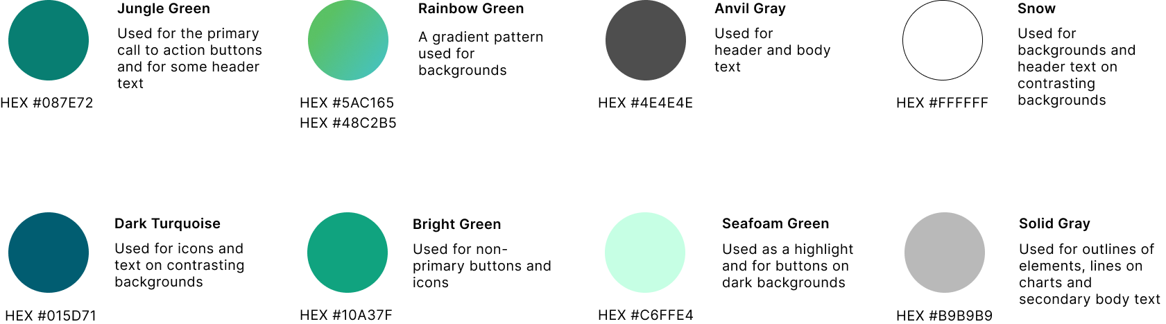
Colors
I chose a color palette of various tones of green to connect the user with the idea of nature at its peak season. It provides a calm yet bright feeling to the app. I selected a dark green for the buttons and text to ensure accessibility, as mentioned above.
Typography
SF Pro Display was chosen for headers because it is simple yet authoritative. Roboto was chosen for body text for its readability.

Next Steps
Further Iteration
If I were to spend more time developing this app I would work on:
Testing and iterating on the ‘Learn’ and ‘Community’ tabs. In retrospect I didn’t have enough specific insights from my user research or usability tests to know the best ways to serve users with these two tabs.
Designing and testing additional functionality such as tracking when users are close to running out of their supplements and making it easy to reorder.
Adding the ability to log specialized vitamin treatments such as iron infusions.
Further testing to discover additional user needs related to vitamin levels and supplements.
How to Measure Success for the App
I would measure the success of this app by:
Monitoring usage and dropoff rates - specifically measuring how many people use the reminder notification feature and/or add their vitamin test results over time.
Gauging satisfaction levels through reviews, and conducting a survey to calculate the net promoter score.