
StudyBreak
StudyBreak is a mobile app that helps users study digital flashcards in brief periods while on the go. Users can add flashcard sets of their own or search for existing flashcard sets to study.
The Project
The challenge for this project was to create a mobile app that empowers people to learn new vocabulary while on the go. A key step of the design process for this app was conducting research to define the core audience.
H I G H L E V E L G O A L S
Design a mobile app that helps people learn new vocabulary
Include features that allow users to customize their studies
Define the StudyBreak UI and visual identity
Role
UX/UI Design
Scope
Mobile App:
User Research, User Flows, Wireframes, Usability Testing, UI Design
Tools
Figma
Research & Empathize
What types of people need to learn new vocabulary?
I started this project wanting to know more about the different types of people who want to learn new vocabulary and the problems they encounter in doing so.
I conducted user research with three participants in different stages of life - an undergraduate college student, a mid-30s graduate student, and a writer wanting to keep their skills sharp.
Defining the audience for this app
In my user interviews the participants who had the most need for learning vocabulary were the undergraduate college student and the graduate student back when he had to study for the GRE - so I decided to focus on college students as the core audience in my design process.
Since undergraduate students often also need to start studying for the GRE, I combined these needs in one persona.

Findings:
Participants felt a rang of emotions when it came to learning new vocabulary - curious, excited, intimidated, and tired
Having an upcoming test was the most motivating factor for wanting to learn new vocabulary
Challenges included negative self-belief about memorization skills, the process being tedious, and paper flashcards being cumbersome
All participants noted that they need to see a word multiple times for them to really remember it long term
Having some way of learning that is fun is important
What other apps already exist?
To get an understanding of the competitor landscape I researched, downloaded and analyzed three existing apps for learning vocabulary.
I found only one that allowed users to create their own sets of flashcards.
Some interesting features of the various apps included:
A progress bar is visible during the quizzes, giving a sense of progression towards the next milestone.
Game feature has a good visual timer that really makes you feel the urgency of the time running out. The time pressure makes you want to keep playing more.
Include a "Not Sure" response option so you don't have to guess at random.
The option to add a widget to your phone so you will see vocabulary on your phone homescreen.
Allow visual customization of your background in the app and widget.
Ideation & Design
Thinking through features
With an understanding of who I was designing for, I took some time to brainstorm ideas with this question in mind -
How might we make a vocabulary learning app fun and engaging so that users can learn efficiently and effectively?
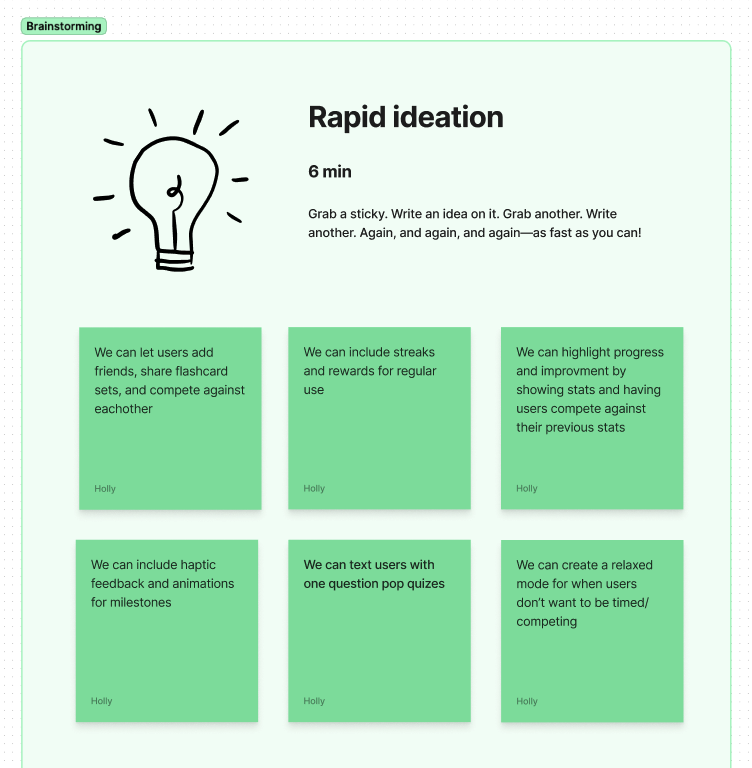
I then narrowed down these ideas to those that would impact the core functionality of the app.
This included:
Enable users to add friends, share flashcard sets, and compete against each other
Highlight progress and improvement by showing stats
Create a relaxed mode for when users don’t want to be competing
Include streaks and rewards for regular use
User Flows
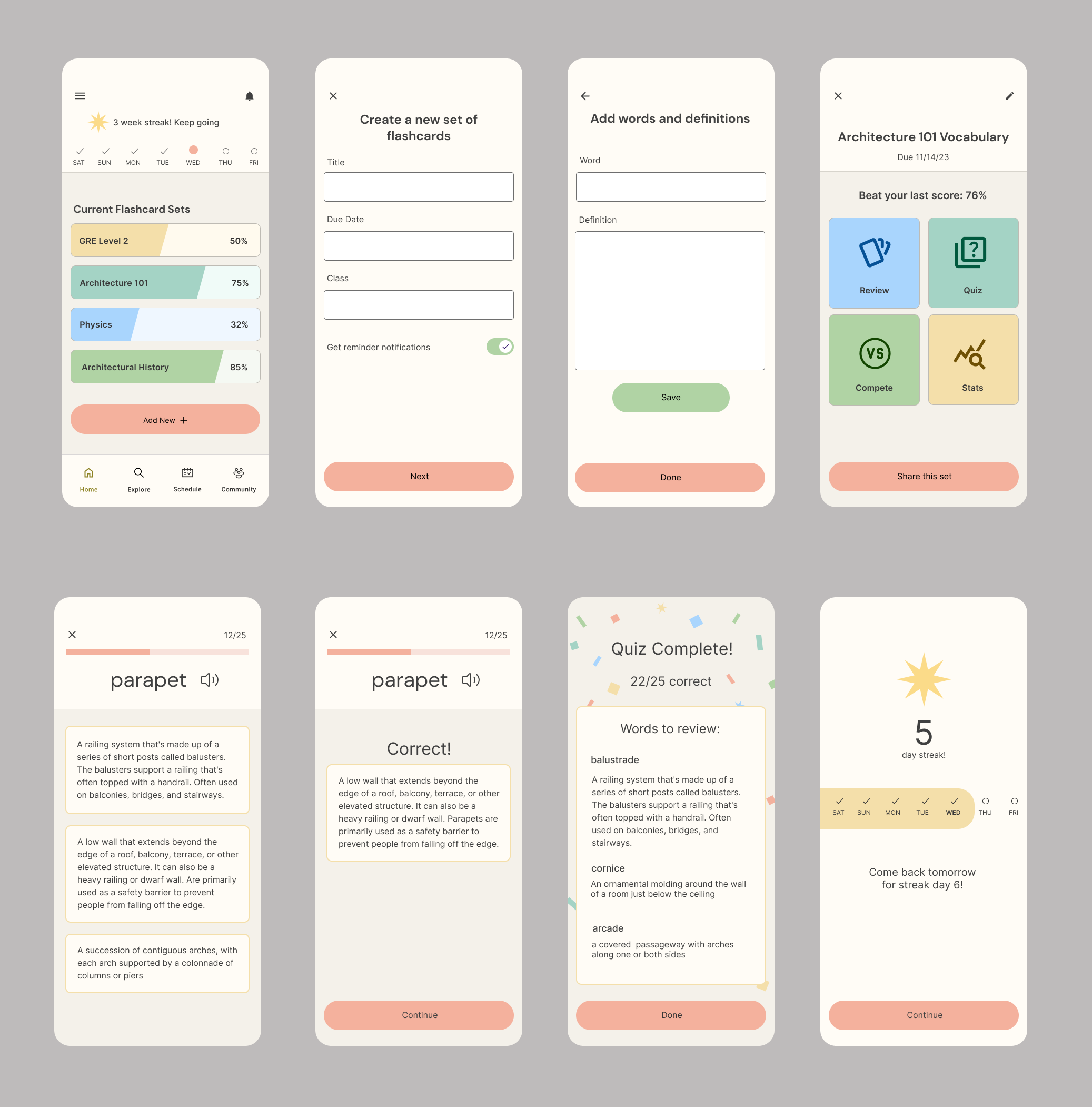
To begin the process of defining paths through the app, I created user flows for two core features - adding a new set of vocabulary, and for completing a quiz in the app. This gave me an understanding of the key screens that I needed to create for my low-fidelity wireframes.

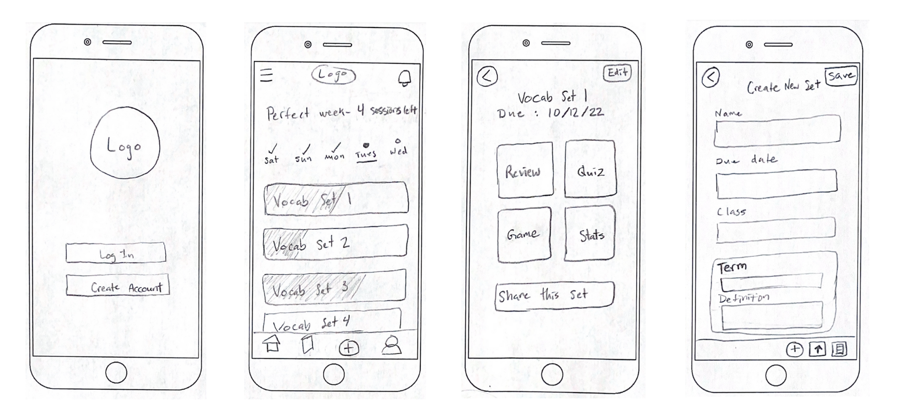
Sketching Low-fidelity Wireframes
I then started out sketching those screens with a pencil and paper, coming up with several different ideas before choosing the best option for each screen. I created each screen in the user flow I had mapped out earlier so that these wireframes functioned as a paper prototype.
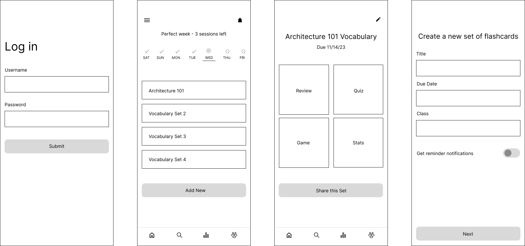
Mid-fidelity Wireframes
Next I created mid-fidelity wireframes and further refined the details from my paper sketches. I created a mid-fidelity prototype out of these screens to prepare for usability tests.
Gathering Feedback & Iterating
Usability Testing
I conducted usability tests with three participants using my mid-fidelity prototype. Users were asked to complete onboarding, add a new seat of flashcards, and take a quiz in the app.
Discoveries
01 Unclear when/how often reminder notifications will be sent
Solution: Added a separate scheduling screen after words and definitions are added so users can get reminders at specific times

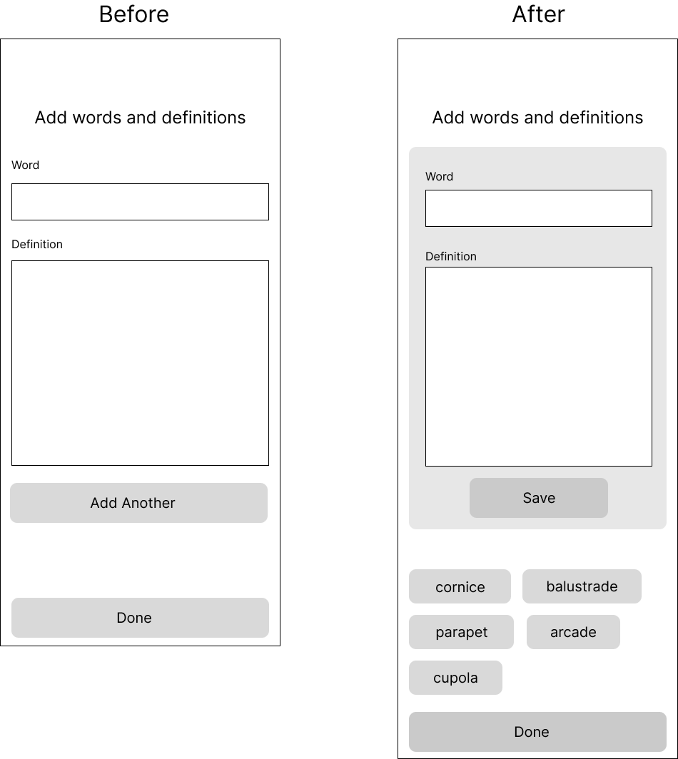
02 Felt confusing to have the entry fields return to being blank when pressing the “Add Another” button
Solution: Include a list of words at the bottom so users can have confirmation that they successfully added a word and see what they have created so far
03 Some users skipped the review missed questions feature
Solution: Added the words to review on this screen so users can easily look them over without having to take an extra step

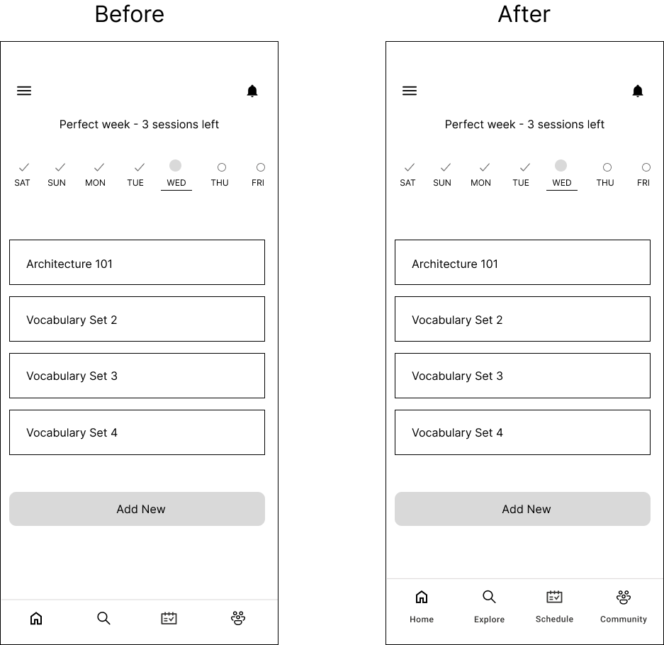
04 Navigation bar icon meanings are unclear
Solution: Added labels to navigation icons
Crafting a Visual Identity
Style Guide
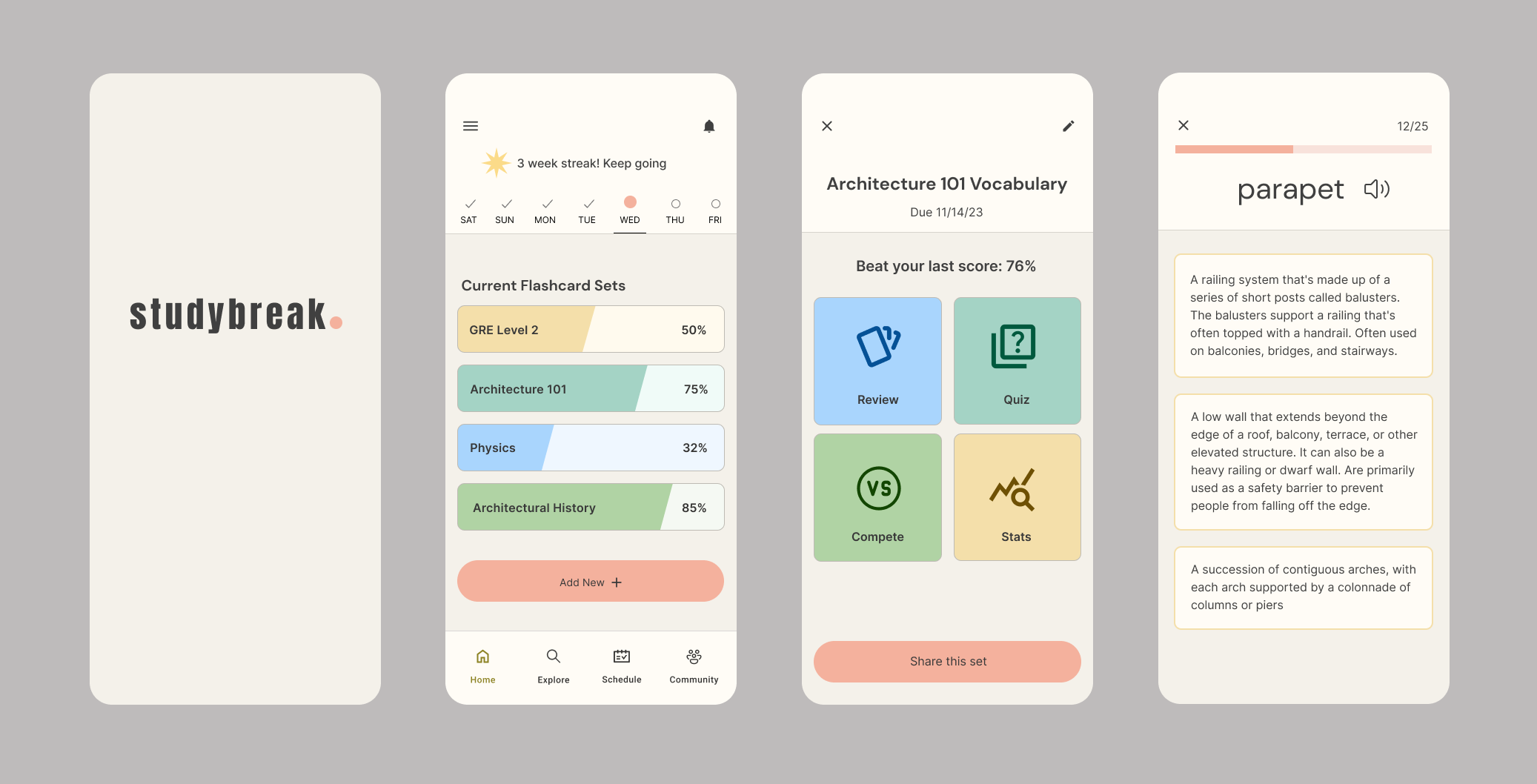
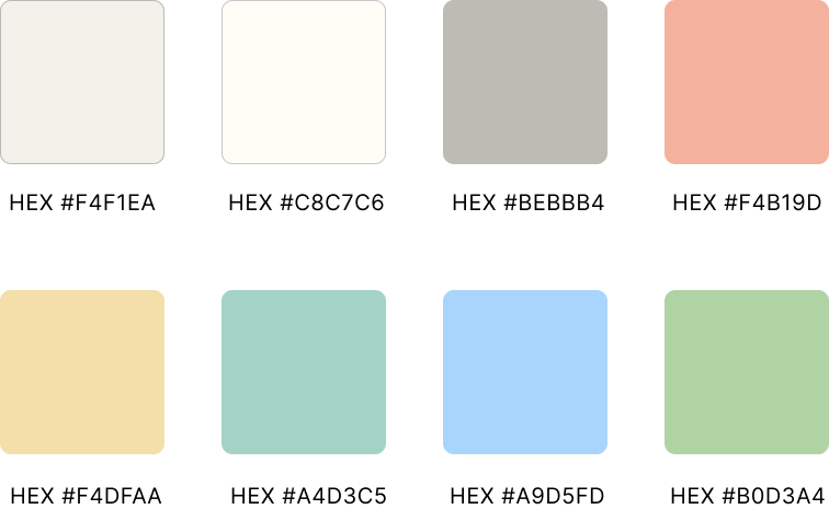
In creating the visual identity for StudyBreak, I wanted make sure that it supported the goal of helping users to study efficiently and effectively. This meant aiming for a simple interface, that is calm yet engaging. I chose a color palette of muted tones, while still including a variety of colors to keep things visually interesting. I also ensured that the color scheme is compliant with WCAG 2.1 accessibility standards.
Colors
Typography
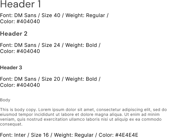
I used DM Sans for headers because it has personality while still maintaining its readability. Inter is used for body text because it is simple and easy to read in large blocks of text.
High-fidelity Wireframes
Next I worked on bringing my wireframes into high-fidelity based on my style guide. I further refined all the onscreen elements during this process, ensuring all elements were alined to the grid and looking their best.
Next Steps
Considering Additional Personas
I would want to interview and conduct usability testing with teachers to see how they might incorporate the app into their curriculum by sharing flashcard sets with their students.
Adding Engaging Touches
In my original brainstorming I came up with the idea to include animations and haptic feedback to enhance the app, making it more fun to use. While I didn’t have time to focus on these features during these initial design phases, I would want to spend time exploring the possibilities for different animation designs and consider where to include haptic feedback.