
Mixingle
Mixingle is a responsive website designed for a startup events company seeking to bring people together and foster friendship through in-person hosted events.

The Project
Fitted is an exercise app intended to help people who do not have much time for exercise find a routine that works with their lifestyle. I took a mobile-first approach and designed a responsive web app that users can log into on any device to complete their customized workout routine. The project focused mainly on composition, visual design, and UI.
H I G H L E V E L G O A L S
Design a responsive web app that helps people work out from anywhere
Make using the app an easy and enjoyable way to exercise
Include features that allow users to customize their experience
Define the Fitted brand and visual identity
Role
UX/UI Design
Scope
Responsive Web App:
User Flow, Wireframes, UI Design, Style Guide, Mobile Prototype
Tools
Figma
Ideation & Design
User Flows
To begin I created a user flow based on the user stories provided in the project requirements. This gave me a clear view of the steps a user needs to take to achieve their goals and what screens would be required.
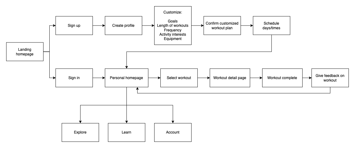
Low-fidelity Wireframes
I then started out sketching those screens with a pencil and paper, coming up with several different ideas before choosing the best option for each screen. I created each screen in the user flow I had mapped out earlier so that these wireframes functioned as a paper prototype.
Mid-fidelity Wireframes
Next I created mid-fidelity wireframes and further refined the details from my paper sketches. I found that some ideas sketched on paper didn’t look quite right once translated into higher fidelity and so I brainstormed other possibilities. I also set up an 8pt grid system and ensured that all elements adhered to it.
Visual Design
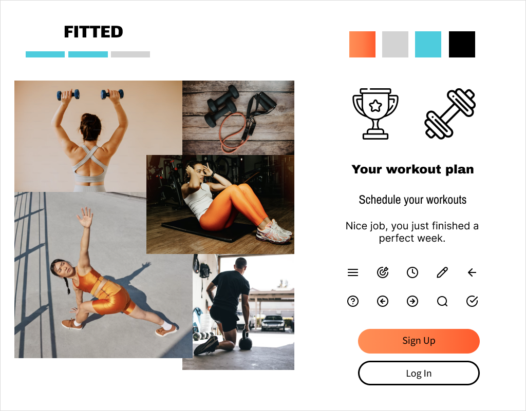
Moodboards
I created a visual identity for Fitted, keeping in mind the app’s focus on motivating users achieving one’s fitness goals. I started out by creating a couple different moodboards to explore different color scheme options and selecting one to move forward with. When creating the moodboards I also ensured that the color schemes were compliant with WCAG 2.1 accessibility standards.
I wanted the app to be energizing and motivating, but also simple and crisp. I wanted to keep the UI light so I have used a primarily white background with various tones of gray and thin lines as the dividing elements. I also worked on selecting typography and imagery to reflect the bold and confident mood of the app.
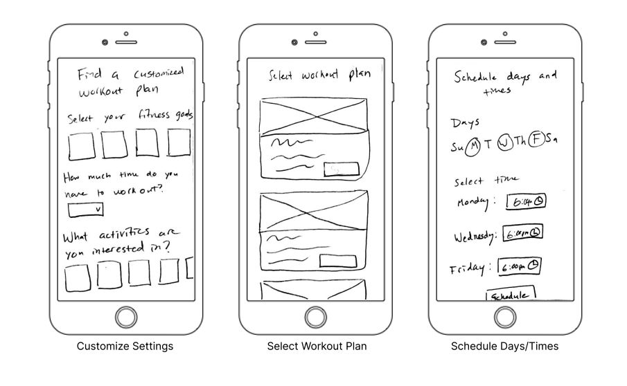
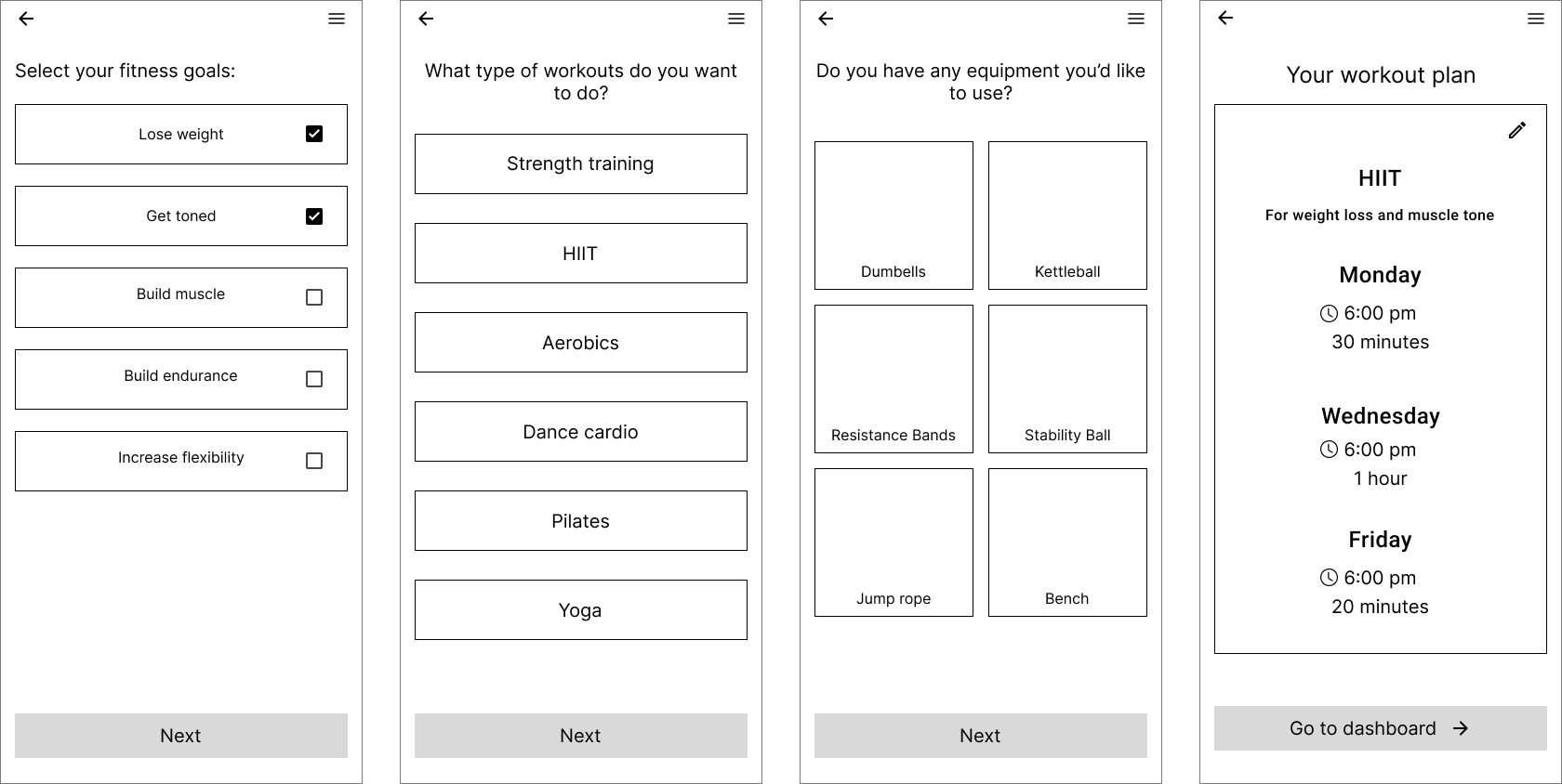
High-fidelity Wireframes
Next I worked on bringing my wireframes into high-fidelity based on my selected moodboard. I further refined all the onscreen elements during this process, making any adjustments needed to ensure the layouts looked their best.
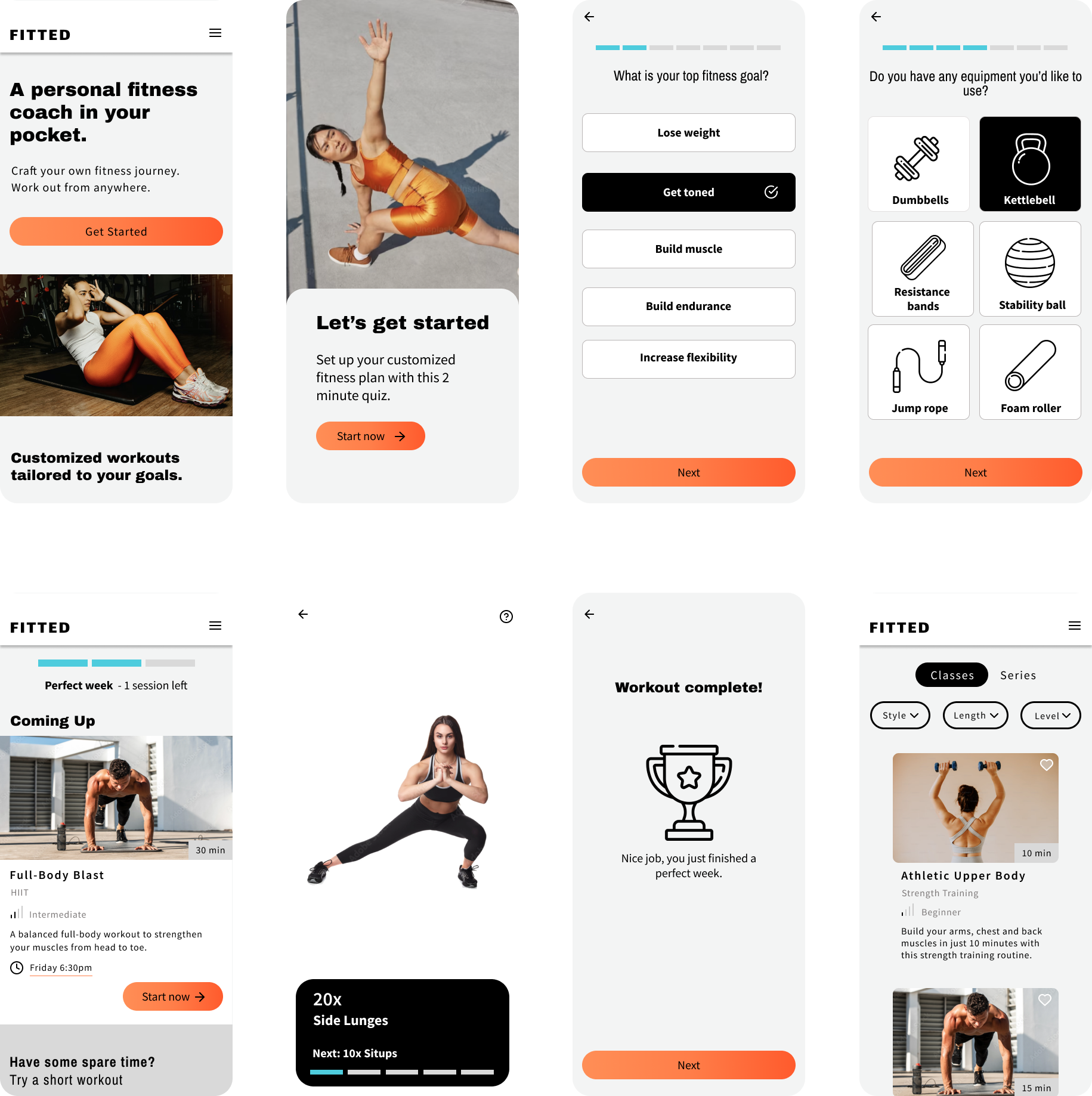
Style Guide
After applying the ideas developed in my moodboard to my wireframes, I created a style guide to document all the stylistic decisions I had made. To view the style guide click here.
Responsive Design
Designing for Tablet and Desktop
I approached the project with a mobile-first design strategy, focusing on developing the layout for all the screens on mobile devices. At this point I was ready to work on the responsive design aspect, and I adapted the layouts for two additional breakpoints. The tablet and desktop versions feature more side by side elements compared to the mobile version where everything has to be stacked vertically.
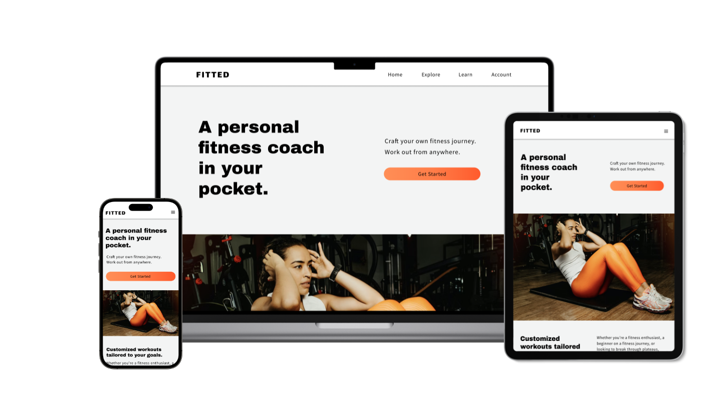
High-fidelity Prototype
Mobile Prototype
I created a basic prototype of the app for mobile. You can interact with it below or click here to open it in a new window.
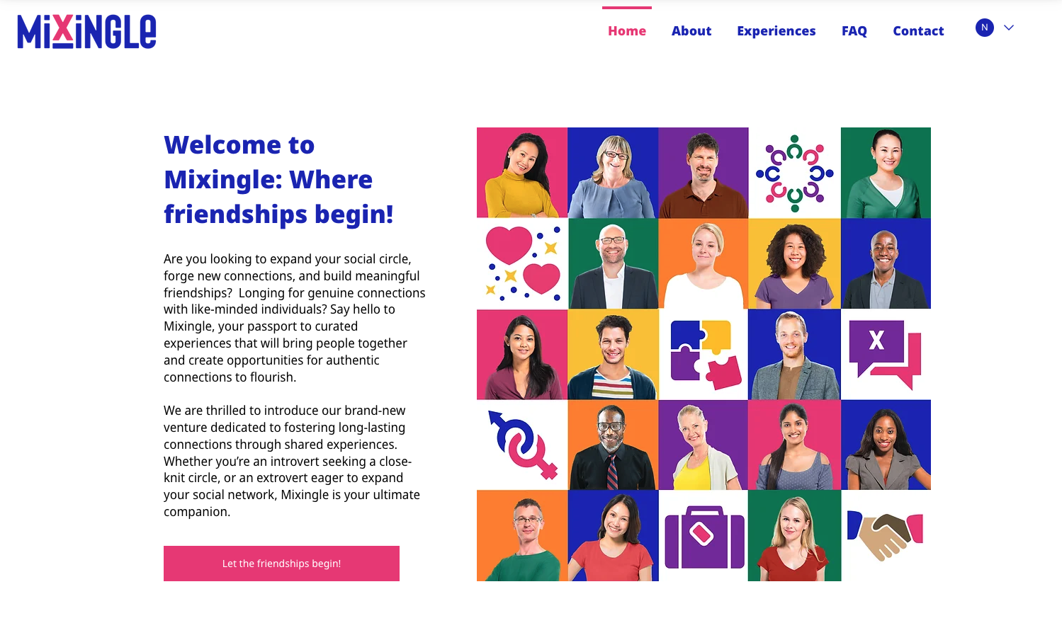

Helping people cultivate close friendships
I designed a responsive website for a startup events company aiming to bring people together in person to build close connections and find friends. I focused on UX design, and implemented the visual brand guidelines that were provided by the client.