
Fitted
Fitted is a responsive web app that provides personalized fitness plans and helps users explore new types of exercise on their own schedule.
The Project
Fitted is an exercise app designed to help people who do not have much time for exercise find a routine that works with their lifestyle. I took a mobile-first approach and designed a responsive web app that users can log into on any device to complete their customized workout routine. This project focused mainly on composition, visual design, and UI.
H I G H L E V E L G O A L S
Design a responsive web app that helps people work out from anywhere
Make using the app an easy and enjoyable way to exercise
Include features that allow users to customize their experience
Define the Fitted brand and visual identity
Role
UX/UI Design
Scope
Responsive Web App:
User Flow, Wireframes, UI Design, Style Guide, Mobile Prototype
Tools
Figma
Ideation & Design
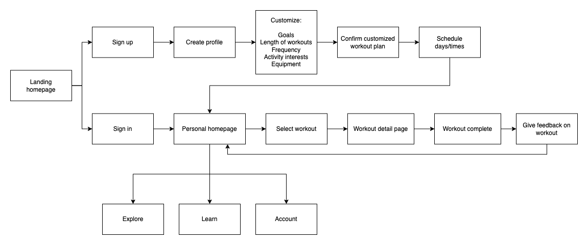
User Flows
To begin I created a user flow based on the user stories provided in the project requirements. I worked on defining two primary paths through the app - new users and existing users. For new users I had to think through the questions I needed to ask in order to allow users to customize their fitness routine. For existing users I thought through all the screens a user would encounter as they go through the process of completing a workout.
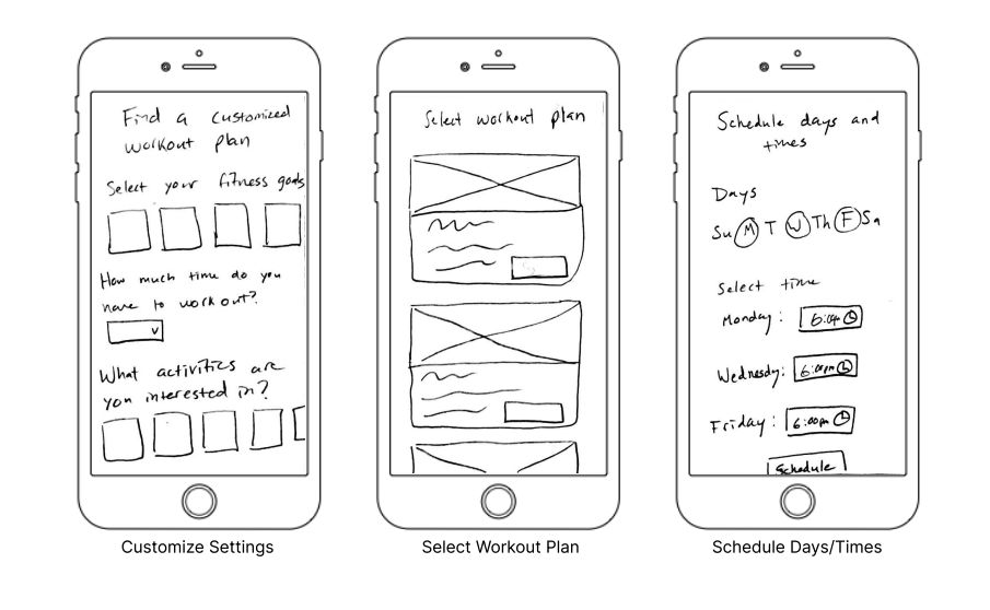
Low-fidelity Wireframes
I sketched low-fidelity wireframes for the screens I had identified in the user flow. These were a good jumping off point for thinking through the onboarding and customization process.
Mid-fidelity Wireframes
As I was bringing the screens into mid-fidelity, I further thought through the user experience and I made some changes - such as separating the fitness customization questions into individual screens, so the process is less overwhelming.
Visual Design
Moodboards
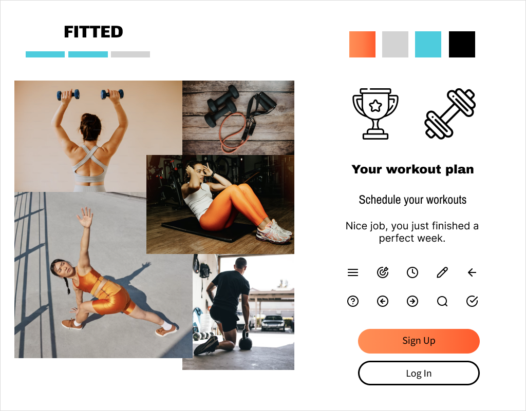
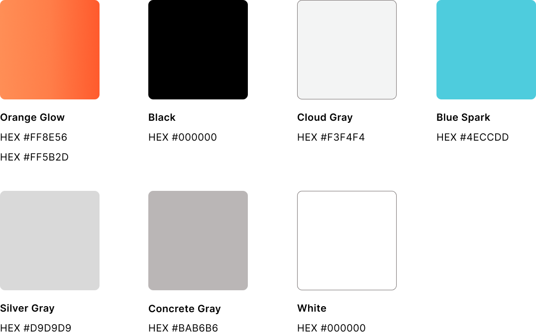
While creating a visual identity for Fitted, I thought about the app’s focus on motivating users to achieve one’s fitness goals. The app is intended to be energizing and easy to use - this translated into a simplistic black, white, and gray interface with a vibrant orange gradient for the buttons. I also selected typography to reflect the bold and confident mood of the app, and imagery showing people who are active, calm and focused (while also tying them in with the orange color accent where possible.)
I started out by creating a couple different moodboards to explore different color scheme options and ultimately decided to move forward with this one.
The color palette is compliant with WCAG 2.1 accessibility standards.
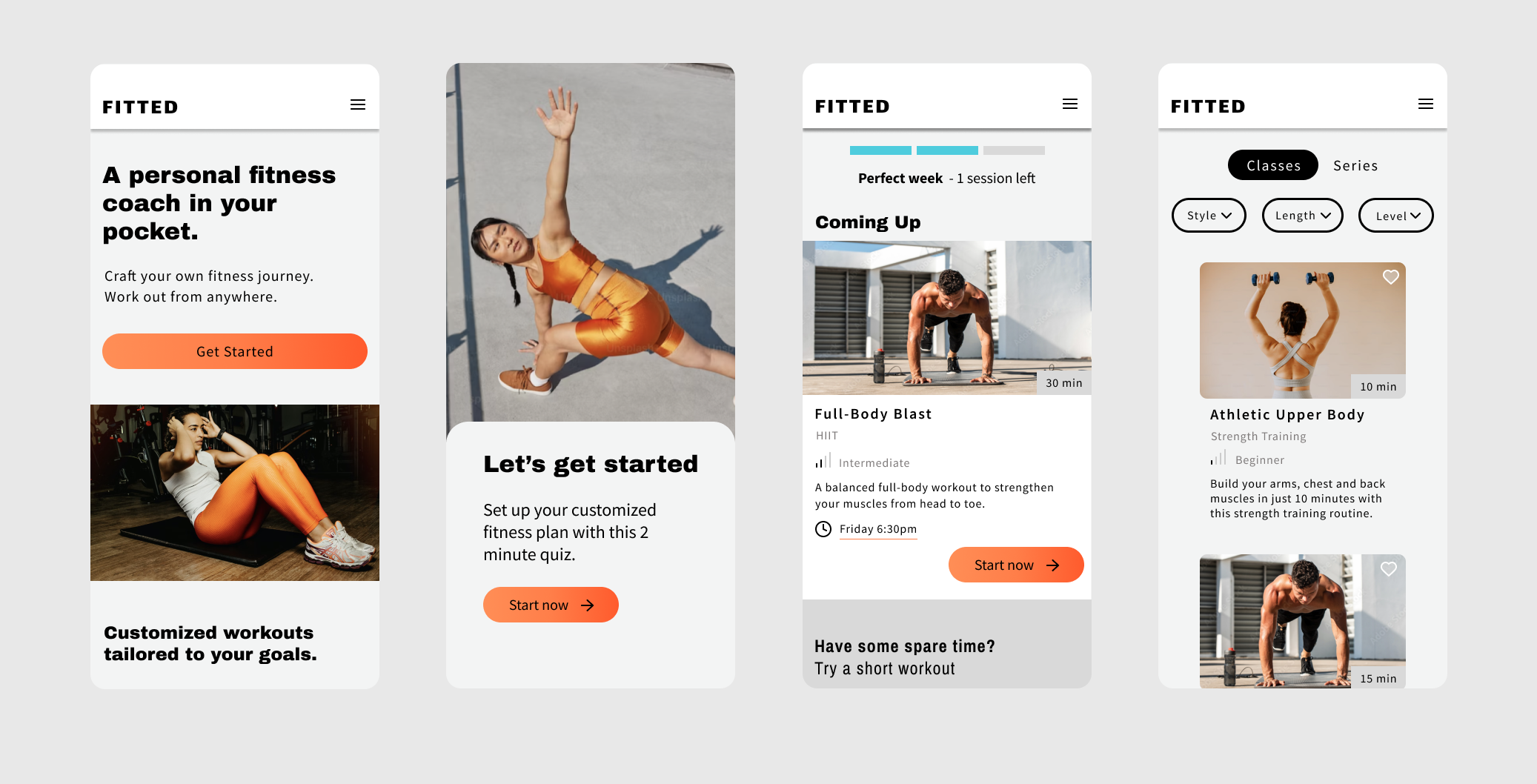
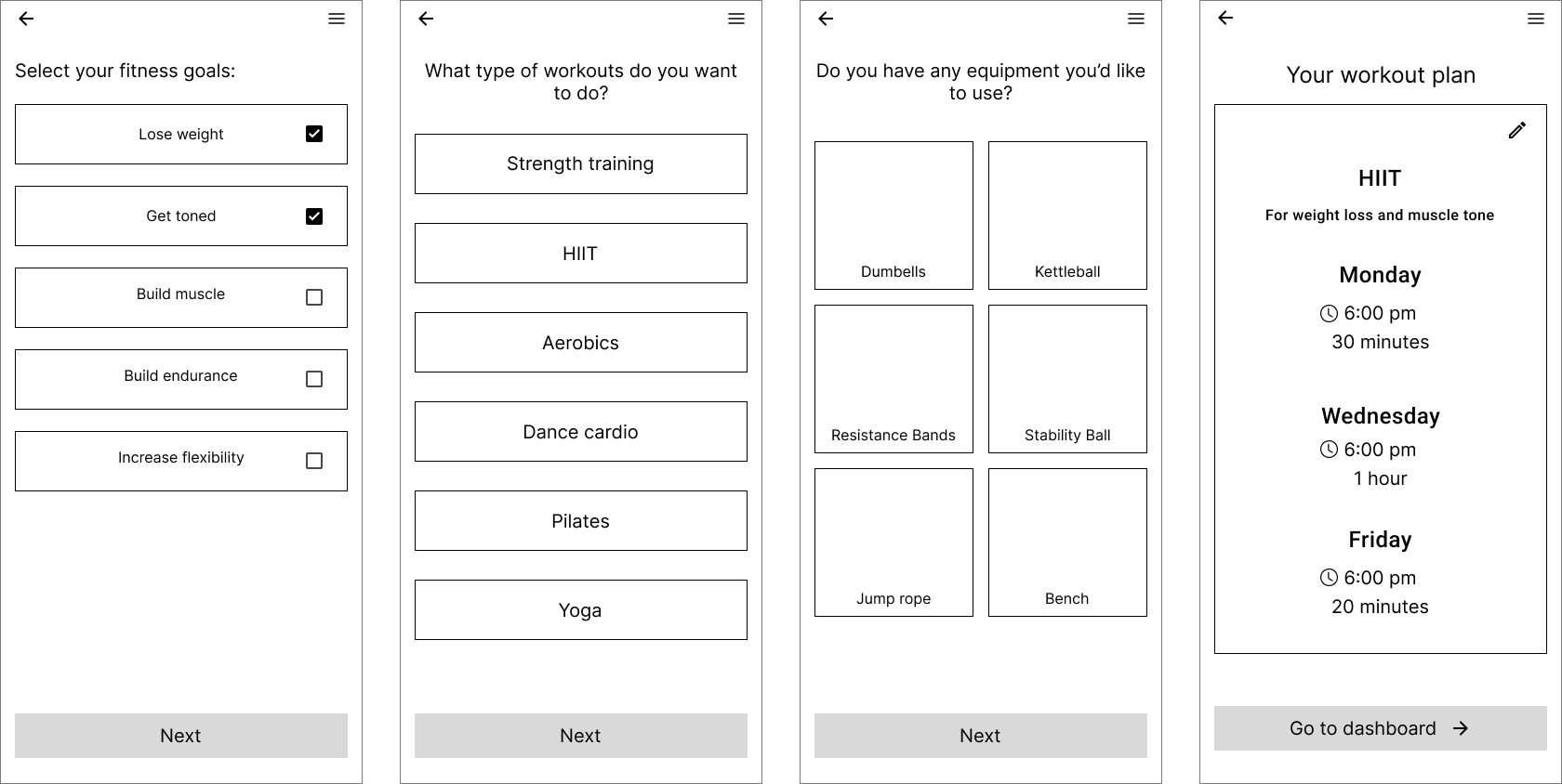
High-fidelity Wireframes
I worked on bringing my wireframes into high-fidelity based on the moodboard. I further refined all the onscreen elements during this process, making any adjustments needed to ensure the layouts looked their best.
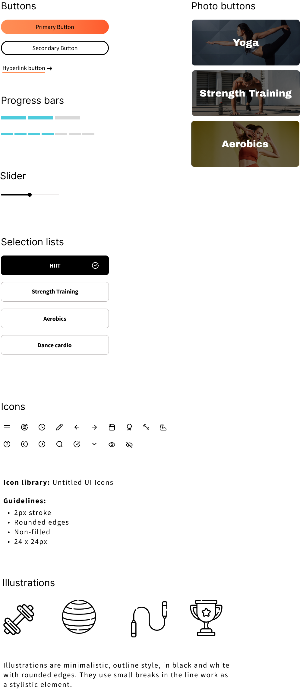
Style Guide
To open the full style guide in a new window click here.
Colors
Tyopography

UI Elements
Responsive Design
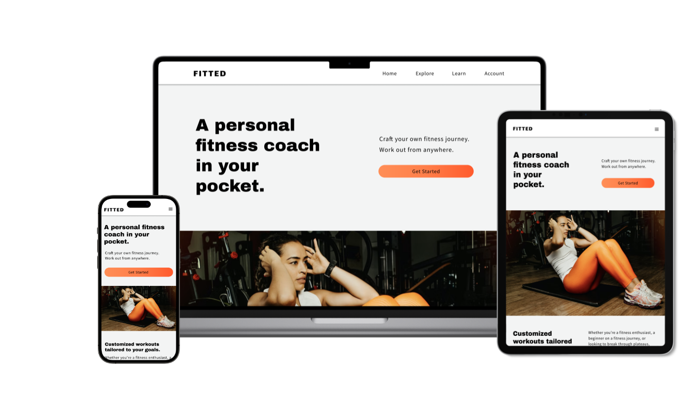
Designing for Tablet and Desktop
I approached the project with a mobile-first design strategy, focusing on developing the layout for all the screens on mobile devices. At this point I worked on the responsive design aspect, and adapted the layouts for two additional breakpoints. The tablet and desktop versions feature more side by side elements compared to the mobile version where everything has to be stacked vertically.
High-fidelity Prototype
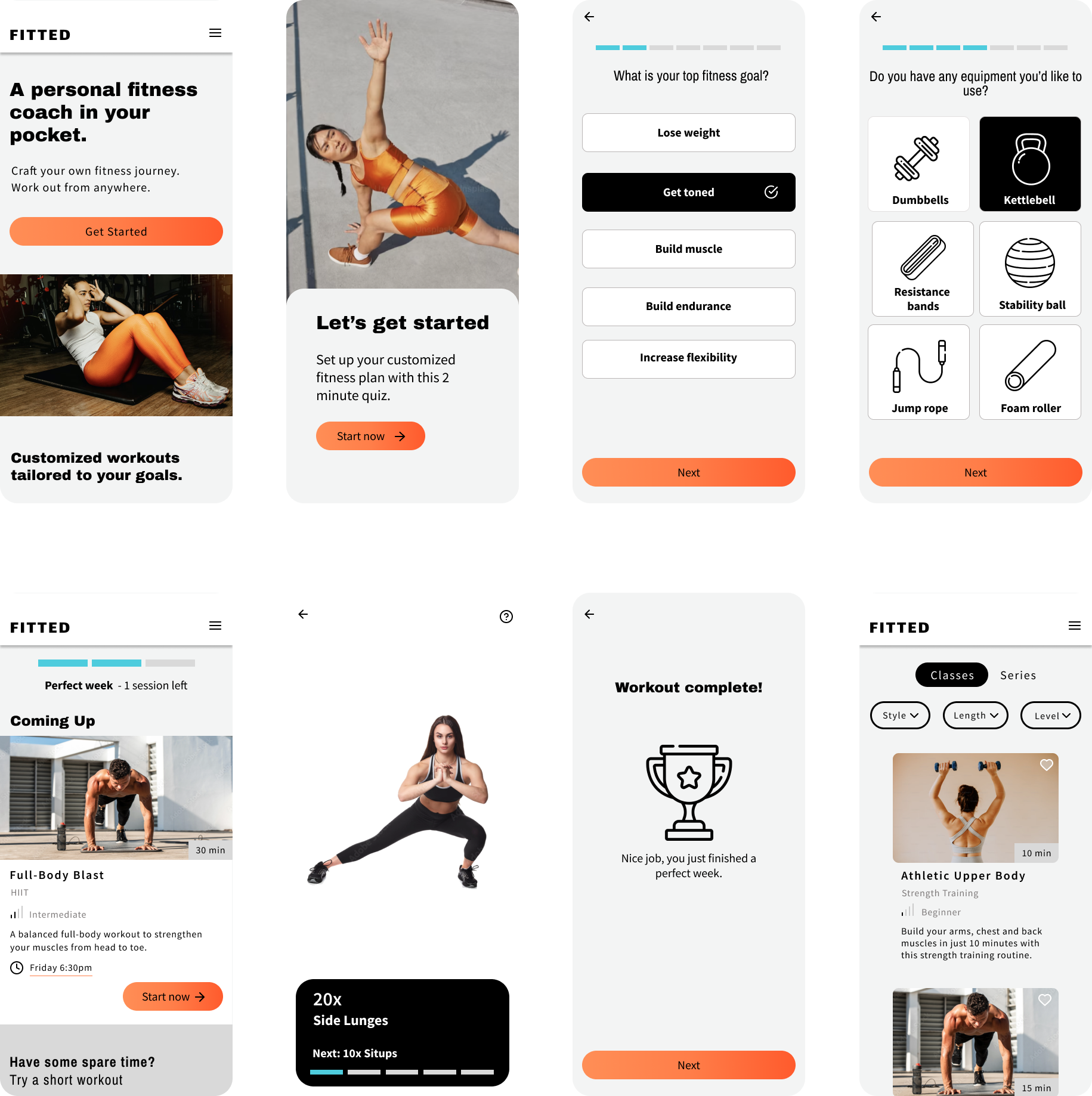
Mobile Prototype
I created a basic prototype of the app for mobile. You can interact with it below or click here to open it in a new window.
Next Steps
If I were to continue working on this project I would:
Conduct usability tests with the high-fidelity prototype and get feedback on both the usability and the UI design
Create prototypes for the desktop and iPad versions of the app and test those as well
Continue to iterate based on those findings