
Providing data for improved social work outcomes
Overview
Better Angels LA is building software to help non-profit homeless outreach organizations better serve their clients, allocate resources more effectively, and track their outcomes so that they can improve their processes.
They needed to design a performance tracking dashboard that displays metrics for each of the stages of outreach.
I worked closely with the product managers to understand the needs that had been identified through research and translate them into wireframes.
I met with the team to present my work and receive feedback. The product managers also brought in a data visualization specialist and senior designers to provide feedback on my designs. After multiple rounds of discussion and iteration, my designs were shown to the CEO for further feedback.
My designs are enabling the organization to get buy-in from their client to build the product.
The problem:
Outreach organizations have a process for helping people transition into permanent housing and achieve independence, but they currently don’t have much insight into the data that will help them improve their performance.
The challenge:
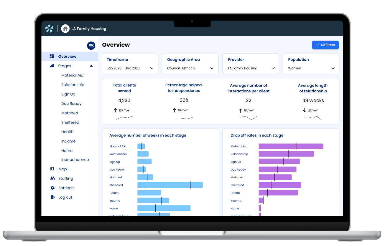
Design a dashboard that helps Better Angel’s client, LA Family Housing, track their performance throughout the different stages of their process, so that they can gain insight into where they can improve.
My Role
UX Designer
The Team
2 Product Owners
2 UX Designers
1 Data Visualization Specialist
Duration
3 Months
Tools Used
Figma
Project kickoff
The product managers provided me with a product requirements document and we had a meeting to discuss the details of what they had found through user research. We reviewed in detail how the client operates and the different stages of their process.
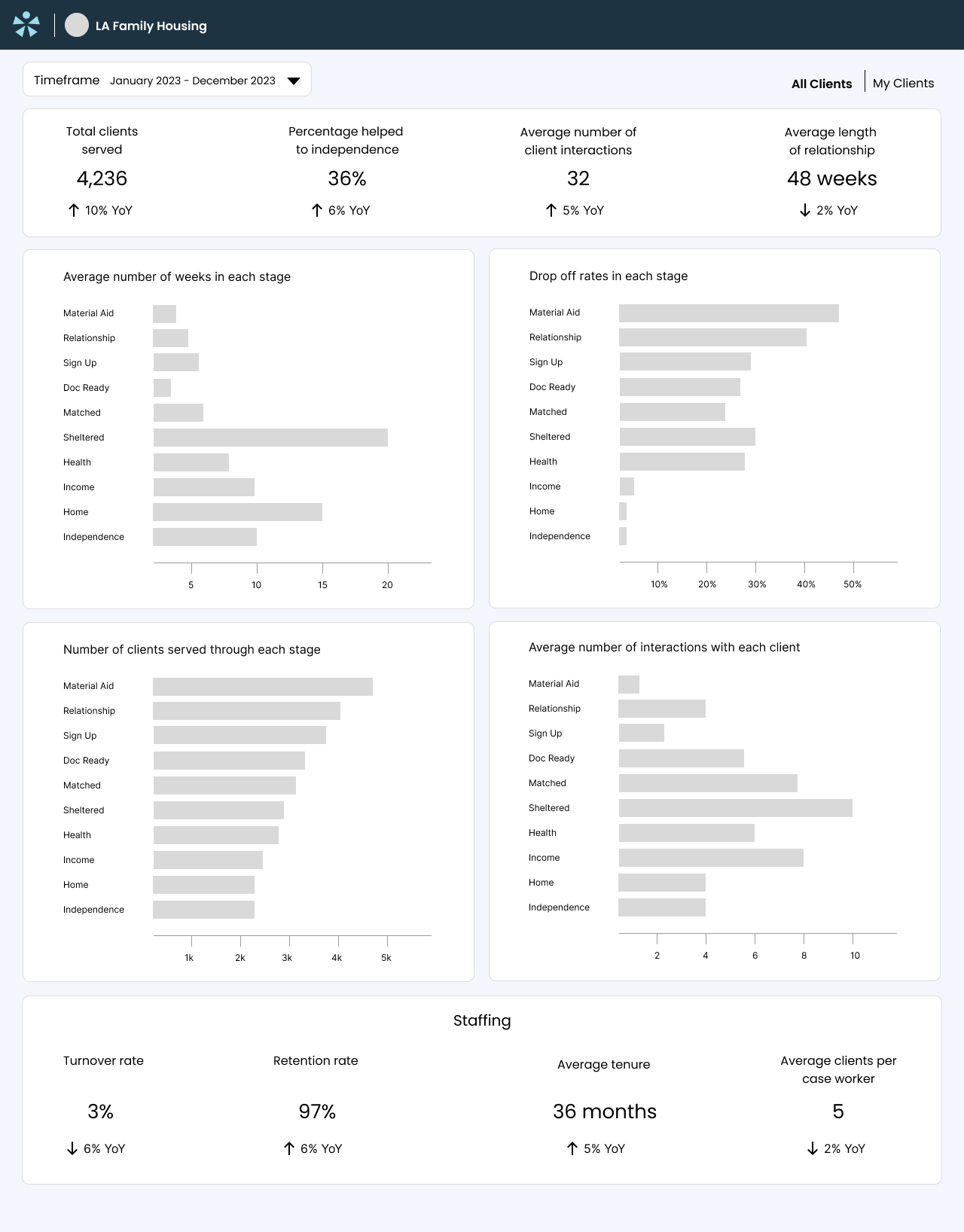
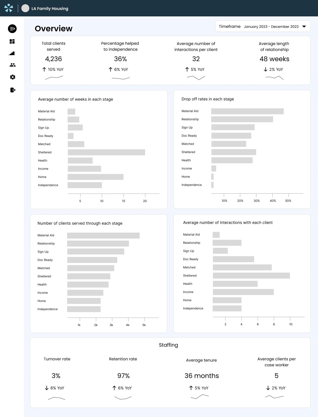
The metrics that they defined to be included in the dashboard were:
The percentage of drop offs by stage of the process
How long on average clients are spending in each stage of the process
The turnover rate for case workers
My design process
My process from here included:
Further studying the requirements and thinking about the different options for representing the data
Writing user stories to further define each user need
Researching the client organization - studying their annual report to understand the type of metrics they report on and what their rough numbers are so I could include somewhat realistic data in the wireframes, as well as identifying potential additional metrics to include in the dashboard.
Conducting visual research to see a wide range of possibilities for representing data in a dashboard.
User research
I conducted additional research by studying the client’s annual report and identified four additional metrics to be included in an overview bar at the top of the screen:
Total clients served
Percentage helped to independence
Average number of interactions with each client
Average length of relationship
In the data visualization section I included two additional metrics to give further insight into each stage of their process:
Number of clients served through each stage
Average number of client interactions in each stage
Drafting initial wireframes as a jumping off point for discussion
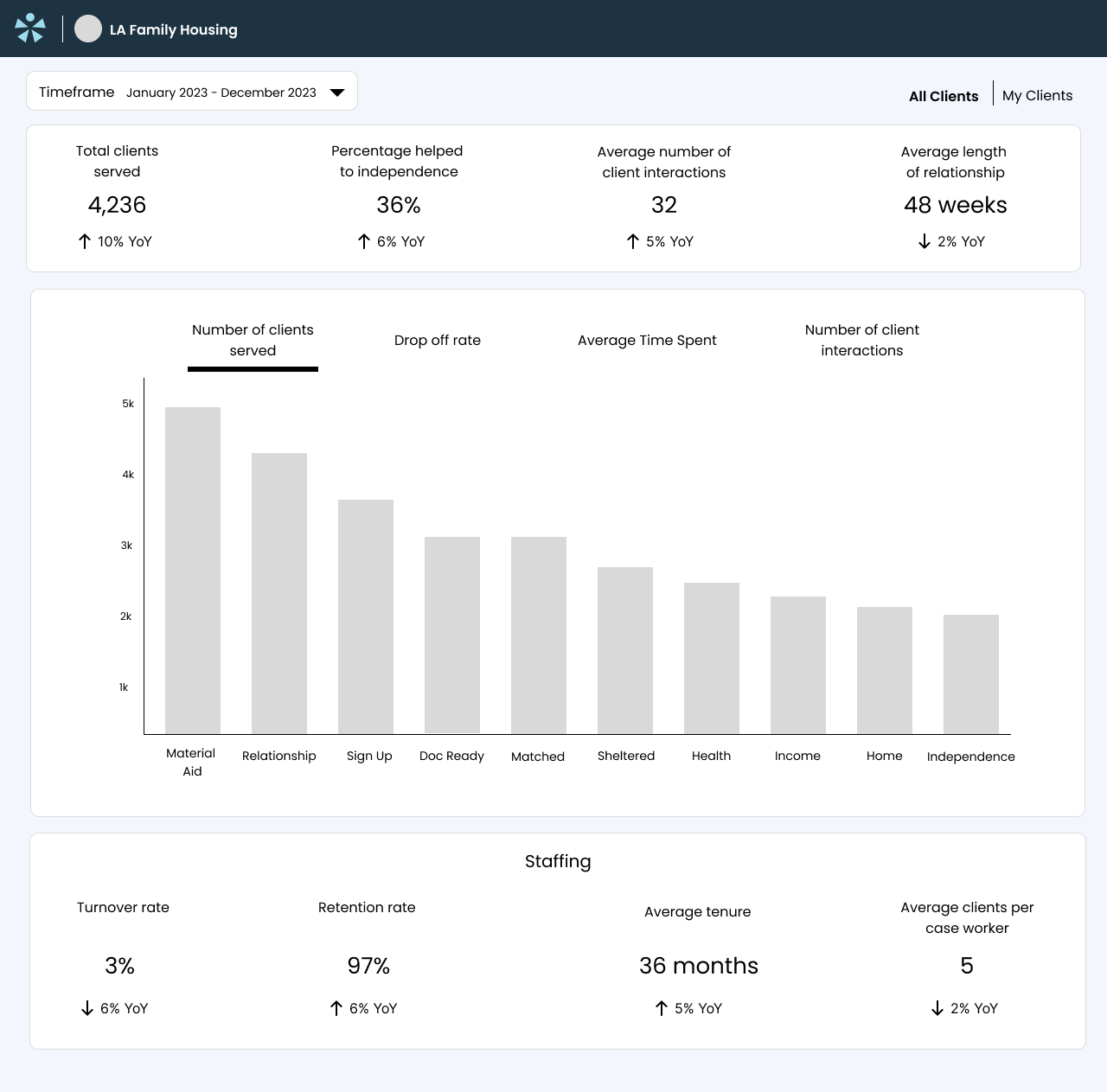
I drafted two different layout options with all of the metrics in the product requirements doc as well as the additional metrics I had identified. These were intended as early sketches in order to prompt discussion of the best way to visualize the data.
Option one included separate charts for each of the metrics, so they could all be seen side by side.
Option two included a single large chart, with selectors to toggle between the different metrics.
Presentation and feedback session - prompts further functionality requirements
I presented the two wireframes to two product managers and a data visualization specialist.
In our discussion of the pros and cons of each option, we determined that it would be most helpful to see all the data side by side so that users can see if there are correlations between the different metrics. This eliminated option two, and allowed me to focus on iterating on option one.
I explained my rationale for including each of the additional metrics and the team agreed that all four of the additional data points I had included would be useful to the client.
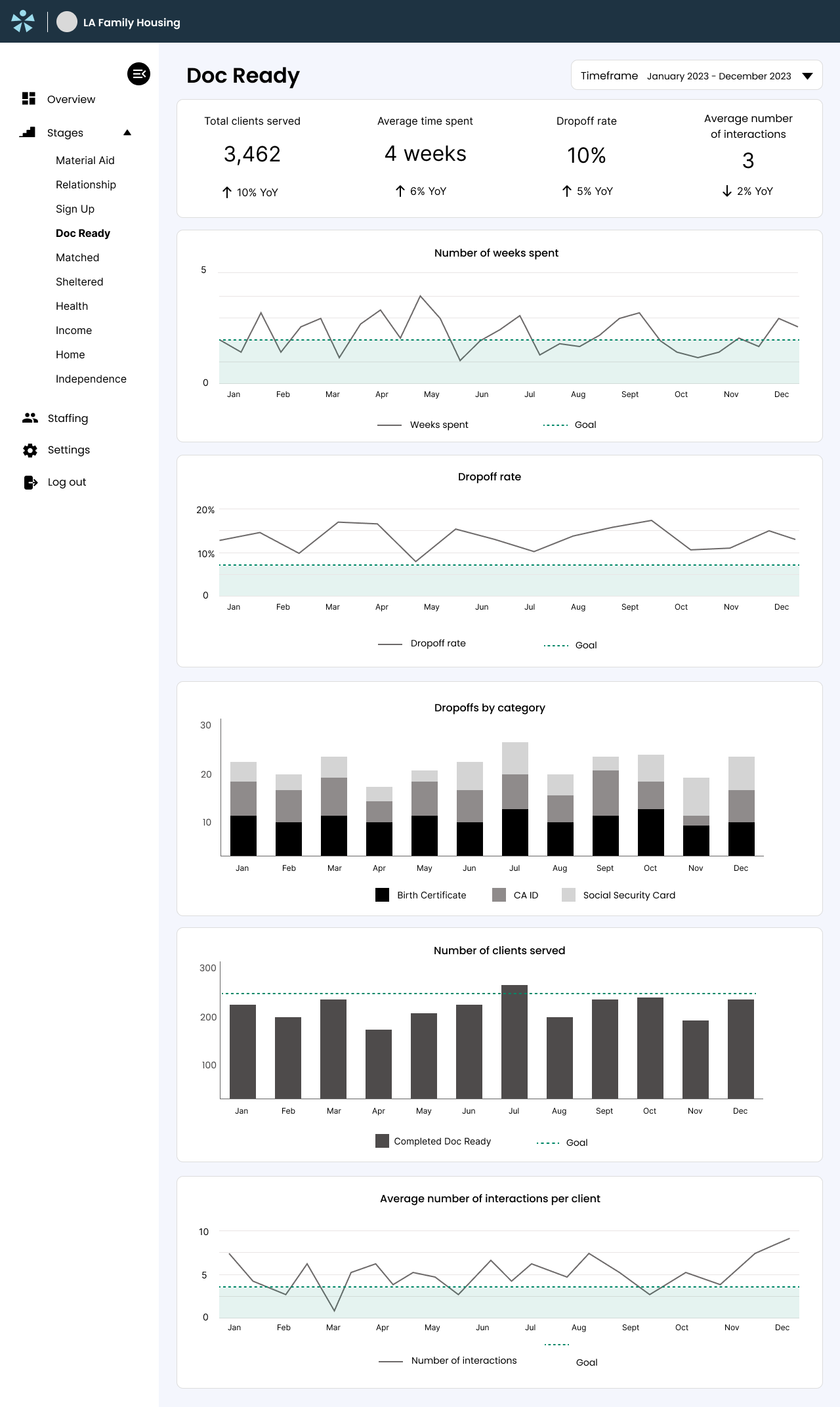
We also discussed showing the data for each specific stage versus showing the overall data - the product manager said that both would be important. This led me to design an additional screen showing one of the individual stages, in the next round of iteration.
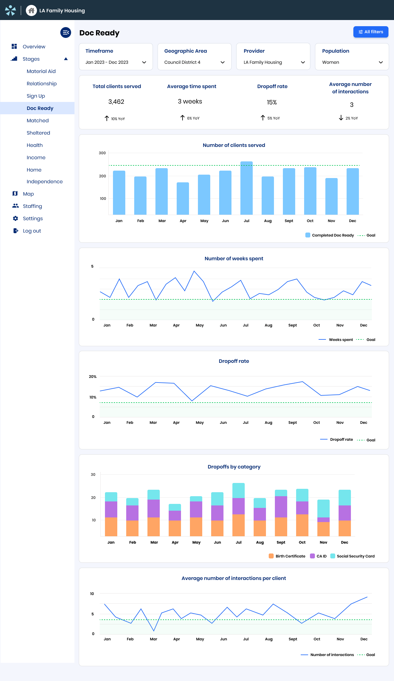
The data visualization specialist also recommended adding sparkcharts to the overall metrics.
One of the product managers asked that we include a way to visualize goals vs actual performance on each of the charts for the specific stages.
Incorporating feedback and designing additional screens
I designed a screen for the “Doc Ready” stage of the outreach process as an example of these stage specific screens. I included charts displaying data over time for each of the metrics that were included on the overview screen. This particular stage also has a multi-part process of verifying the client’s birth certificate, CA ID and social security number, and they may drop out of the process due to any one of these factors, so there is an additional chart for to show the dropoffs by category.
Now that I had a better idea of the different screens that would be included in the product, I also added a expandable side navigation bar to enable the user to navigate to these other views.
Usability testing
I conducted usability tests and gathered feedback from two social workers.
Key findings were:
Collapsible menu is unnecessary/collapsed version is too hard to understand
Need additional filtering for data - would want to be able to see the stats specifically for marginalized groups, area, etc
Goals on the overview page are too hard to read
Incorporating findings and moving into high fidelity
I addressed the issues discovered in testing by making the sidebar menu static, adding filtering at the top of the page, and changing the goals visual from dotted outlines to solid lines.
For the visual design I referenced the established style guide to bring the designs into high-fidelity, and ensured that everything aligned to an 8pt grid.
I worked with other designers to solidify areas of the visual design where there were no established guidelines.
Final review
At this stage the Product Managers presented the designs to all other stakeholders, to prepare for showing them to the client.
The final designs have been approved by the CEO to be shown to their client to get buy-in for building.
Note:
This project was worked on simultaneously with two other projects for the same company. In each review meeting I also presented and got feedback on two other interfaces: a mobile app that enables social workers to easily search and reference resources for their clients while working in the field, and a queue for managing help requests coming from the organization LAHOPS, with a map visualization. I have presented just the dashboard project here to maintain simplicity in the case study.